
You probably recognize the picture below. It’s the standard bell curve, used (and mis-used) by everyone from high school math teachers to insurance company actuaries, government officials, and news reporters.
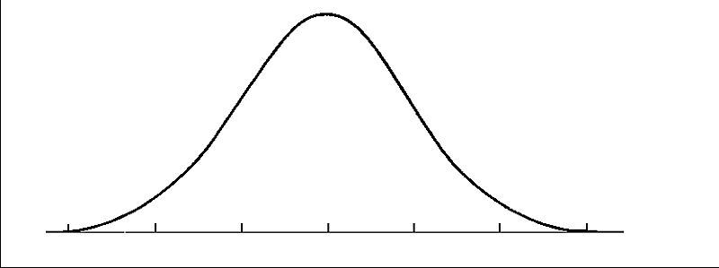
You don’t need to know the math behind the bell curve in order to understand and apply its basic concepts: for all kinds of measurements, there are more average results than any others; and the farther away from the average, the fewer results. So, the average person is of average height, but there are quite a few people who are either a few inches below or a few inches above that. Very short and very tall people are more rare. Again, the average car gets average gas mileage, but there are quite a few cars with close to typical fuel usage. Serious gas guzzlers and extremely efficient cars are more rare. And so on.
One of the most important things to understand about the standard, idealized bell curve is that it is a big, fat lie! There are very few things in life that “fit” this perfect shape exactly. But if it’s a lie, it’s a useful lie. Even though few real life systems fit it exactly, many systems follow it approximately. Including many types of financial investments, which is why I am talking about it.
Another critical concept is that the application of the bell curve depends on the “population” you are measuring. Consider height, for example. When we say someone is of average height, we have to ask: the “average” of what kind of people. Everyone in the world? North Americans of European descent? Men? Women? Fifth graders? Each of these groups has its own average and its own curve. You can’t compare two results until you know what statistics were collected in the first place.
The width of the curve tells you how much variability there is between the largest and smallest numbers plotted on the curve. Again, you don’t need the math to understand the concept: the broader the set of observations plotted, the fatter the curve. For example, the height of 30-year-old European males would vary less than the height of everybody on the planet.
Statisticians measure the width of the bell curve with a calculation called the “standard deviation,” which we will abbreviate SD. We already discussed the fact that most numbers don’t exactly fit the bell curve, but if they did, the following would be true: about two-thirds of the numbers would be within one SD of the average, 95% would be within two SDs of the average, and 99.7% would be within three SDs. So we can compare the SD of two sets of numbers to see which set of numbers has more variability.
To see how this concept might apply to the world of personal finance, take a look at the graph below. It shows the monthly return on investment for a popular Exchange-Traded Fund, SPY, for the last twenty years. SPY represents an investment in the common stock of the 500 largest US companies, known as the “S&P 500.” The blue bars show the actual data; the higher the bar, the more monthly returns were in the range shown. The smooth red curve shows the idealized bell curve with the same average and SD as the return date for SPY. As discussed above, SPY looks approximately, but not exactly, like the bell curve.

Here are some things to notice about SPY over the last 20 years. The average monthly return was about 0.8% per month, meaning that in an average month, the value of an investment in SPY would have been 0.8% higher at the end of the month than at the beginning. Any monthly return between negative 3.57% and positive 5.16% would have been within one SD of the average; any return between negative 7.94% and positive 9.52% would have been within two SDs. This movement around from month to month is called “volatility” in the world of investment research. Remember, these are monthly results. Daily numbers would have been much more volatile!
What do these numbers tell us about how much money you would have made by investing in SPY? As it turns out, not much. That’s because an actual investor’s return would have been influenced not only by the average return, but the specific pattern by which the average result was achieved. It turns out that if someone had invested $100 in SPY on September 1, 1993, re-investing all dividends and leaving the account alone, that account would have been worth $429 on September 3, 2013. This works out to a monthly return of 1.09%, or an annual return of 13.87%.
Here’s another question: what do these numbers tell us about what SPY is expected to do in the future? Well, these numbers tell us nothing about why SPY performed the way it did; they don’t predict anything about future economic conditions, future interest rates, or anything else that could influence stock market performance. However, in the absence of a crystal ball, most investors use numbers like these to make decisions about future investments, realizing that caution is in order.
Remember that in order to interpret these numbers, we have to know what “population” we are talking about. The statistics shown above apply specifically to the S&P 500. A different SD would be observed for small company stocks, or stocks from another country, or other types of investments.
Standard Deviation is the core statistic used in almost all definitions of “risk” for financial purposes. It’s an imperfect but extremely useful number. Since the bell curve itself is a partial lie, SD is too.
The conventional wisdom is: given two possible investments with the same potential return, the one with the lower SD is the better choice; and, given two possible investments with the same SD, the one with the higher average return is the better choice, because you are getting a bigger reward for the amount of risk you are taking. Investors are expected to require a higher return to compensate them for taking on more volatility in the value of their stocks.
This post is not an endorsement of SPY or any other specific investment. I chose SPY for this discussion because it is a widely traded ETF and there is a lot of information available about it. And it does illustrate a central point: over the long run, the S&P 500 has delivered respectable returns, accompanied by significant volatility. If you are investing for the long run, it makes sense to hold stocks as part of your portfolio, but only if you are investing for the long run, and only if you are prepared to weather the bell curve.
